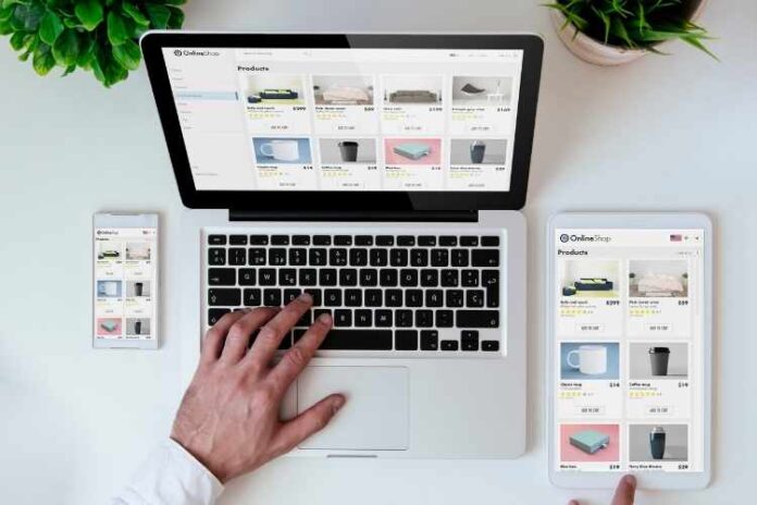
A good website UX has the power to attract and arrest the attention of people. First impressions matter, as they judge your brand based on how professional your website looks. You have only a few seconds to lure them and persuade them to do business with you – or you stand to lose. Seeing how important a good web design is, these principles will help you create the perfect site.
Design a Scan-friendly Website
People have busy lives and so they just scan or skim for the information they need. Your web design should allow for easy scanning, or else they will leave your site quickly. One way to do this is by adding negative space and colour alignment to make it easy to skim your page. You can get the website design services of a company to design for being scan-friendly.
Consistency is key
The colours, fonts, buttons, layouts, and images you use must all be consistent. All of your pages should give the same experience to users and should be easy for the eyes to look at the information. If you make radical changes to your site frequently, your users will get frustrated. Maintaining a style guide and colour theme consistently works well in your favour.
Add a Strong and Powerful CTA
The CTA is the central element that helps you achieve your goals. So use the right colour and contrast to distinguish the CTA from other elements. The placement is also crucial, as the CTA should be visible to the eye. Get the website design services of a company for effective CTA placements.
It’s a journey
For the customer, when they enter your website, their journey begins. You have to guide them and help them explore your brand. Your content is the means you talk to them. Remember that you are giving them a journey, an experience, and an adventure. Forget about the end goal, it’s all about the user experience.
Use familiar features
Your customers would have already visited hundreds of sites. When they enter your site, they should recognize familiar elements and know how to use them. All elements should be familiar and easy to use. You should not let them scratch their heads to figure out how to use your features.
Function vs Form
When you start designing, always keep your goal in mind. Never ever compromise the functionality of a page. A page could be attractive and aesthetically pleasing but it is of no use if it doesn’t get you more sales.
Include only those elements that will bring you more conversions. Right from the start, your site should persuade the customer towards that goal. You can get the help of the best digital marketing company to optimize for functionality.
Be Intentional
Every element on your site should serve a specific purpose. Nothing should be there just for the sake of filling the gaps. The colours and the fonts you use should reflect your brand personality. When you want to design something new, ask why you want to do that. If you have no solid reason, ditch it by all means.
Content to Entertain
A copy in itself cannot get you more sales. It should excite your users and stimulate them with powerful emotions. And more importantly, it should hit at their pain points and empathize with them. Only when you do this, your copy will generate more sales.
Design for the End-goal
The first step in designing is identifying what your goals are. Without goals, your web design will not be powerful enough to captivate people. You should use the goals as your guidelines to design each and every element. When you do this, your site would be highly targeted and encourage people to take the desired action.
Focus on Accessibility
Your site should accommodate everyone, particularly people with special needs. Don’t fret, as the WCAG Guidelines are always there to help you design for accessibility. Your goal is here is to ensure that no one feels left out. To accommodate disabled people, you can add subtitles and videos for your text. And finally, test your site if you can navigate the site with the keyboard alone.
Don’t leave out the search field
People come to your site looking for some information. If your site has a lot of content, it will not be easy to locate the information they need. When you have a search field, they will find it easy to scan hundreds of pages to get what they need. It doesn’t stop there, as the placement of a search field is crucial as well. You should place it in the right-hand corner where it will meet their eyes easily.
Links to Connect Pages
The links on your site should be visible and easily noticeable. It also should tell the user where they would go and leave no room for guesswork. If you refer to other sites on your page, always provide a link to the site. Links help you keep your site organized by building bridges between content with similar themes. So, use links to provide additional information to your users.


![MX Player Custom Codec [AC3, DTS, MLP, TrueHD, and more] MX Player Custom Codec](https://techmenza.com/wp-content/uploads/2021/10/MX-Player-Custom-Codec-100x70.jpg)


